Reduct.Video
Reduct is a collaborative transcript-based video and audio platform for reviewing, searching, redacting, highlighting, and editing content of people talking.
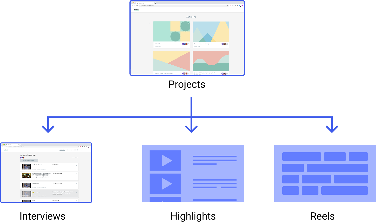
At Reduct, I was the sole designer working with the lead engineer on rapid sprint projects to alleviate some of the friction users were having with the app. This case study is a redesign of Reduct’s projects page, their highest level of navigation, which was experiencing an average of 13 seconds to navigate from the there to the main working pages of the app.

The proposed design took the page from large thumbnails and little information to a dashboard-like display that incorporated many of the organizational features that the original design was missing, such as recent activity and file counts.
Because Reduct's product has three core workflows—highlighting, transcribing, and creating reels—I changed the app's navigation architecture to accommodate those workflows evenly. I added three distinct buttons to help researchers better navigate to their respective project task from the projects page.
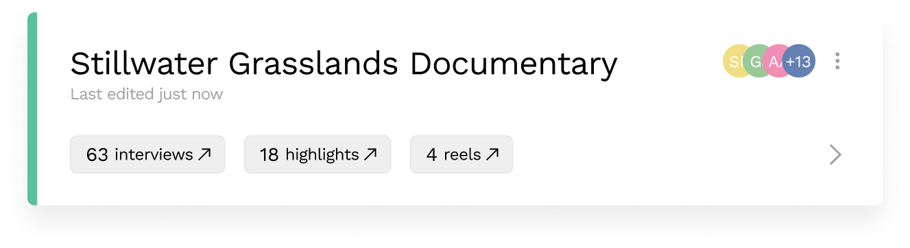
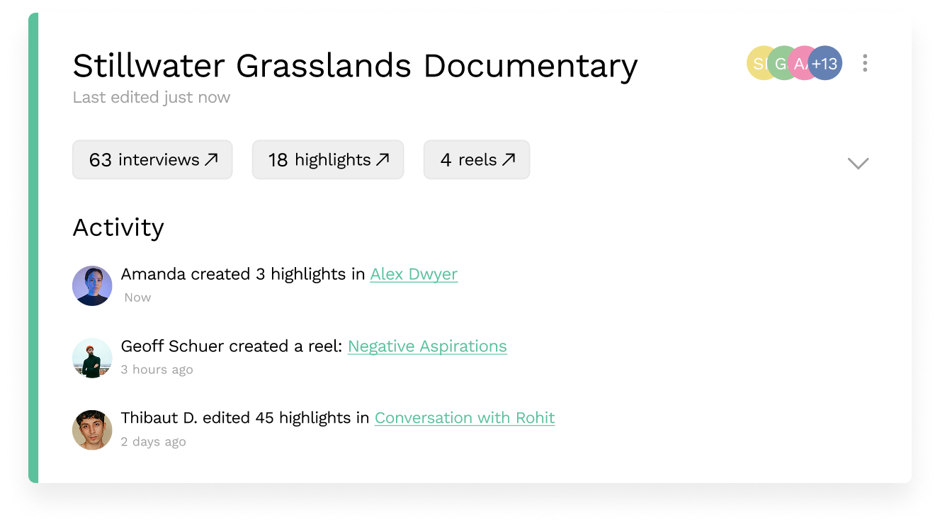

The new projects page was shipped after a one week design sprint. When looking at the usage data after launch, the most clicked links on the page were the three CTA buttons: Interviews, Highlights, and Reels—validating my initial design decision. The launch of the redesign also saw a drop in average navigation time by 8 seconds—60% faster than the old page.
Due to the rapid turn-around time of this project, the next steps for the projects page is to address the visual inconsistencies between the proposed design and the launched page. Despite this, the quick deployment of the redesign has already significantly reduced app friction, and 8 seconds can improve even more with further refinement.


