Reduct.Video
Video & transcription editing simplified
Reduct.Video is a video editing & transcription startup in San Francisco. With Reduct, editing video is as easy as writing a text document. Highlight, cut, and edit text to watch as your video automatically does the same to the video.
During my time designing for Reduct.Video, I was required to wear many hats, ranging from marketing and pitch deck creation, to fast paced product design sprints, including the launch of many products that decreased overall user friction and defined early stage visual style. This is a sample of two primary projects I worked on, the redesign of their All Projects Page, as well as visual and interaction concepts for their main app interface.
01
All Projects Page redesign
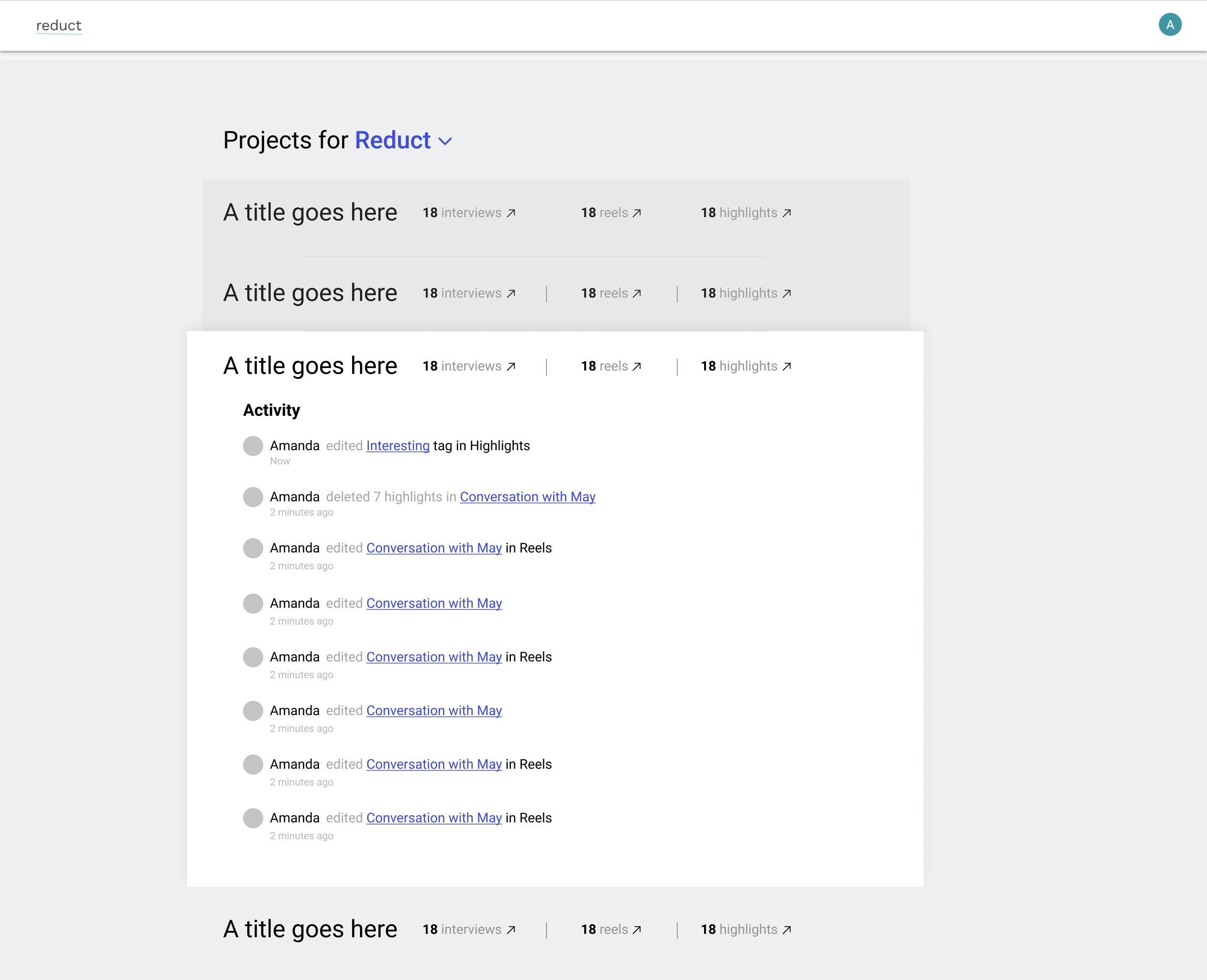
The All Projects Page, Reduct’s highest level of navigation in the app, is where researchers can view and join any project in their organization. The current interface looked nice visually, but was reportedly lacking in usefulness and clarity from researchers. The team of three at Reduct began the project with a hypothesis that researchers using Reduct are active in all parts of the app at any given time over the course of the project. The All Projects Page should be able to access the part of the project they were working on in less than two clicks. To address that, we made three buttons at the highest level of hierarchy so researchers wouldn’t be funneled into a single flow.
The final result was a dashboard-like display of all the important information in a project, such as recent activity and number of interviews. The new page was shipped after a 4 week sprint. When looking at the usage data after launch, the most clicked links on the page were the three entry points: Interviews, Highlights, Reels, on the page——validating our original hypothesis.

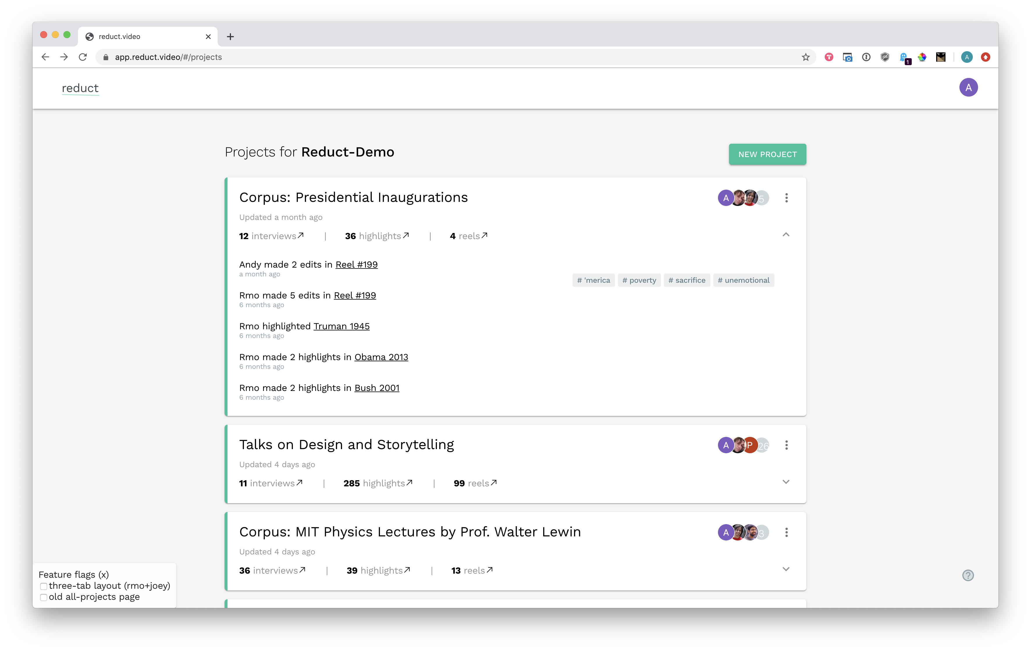
Live version as of February 2020.
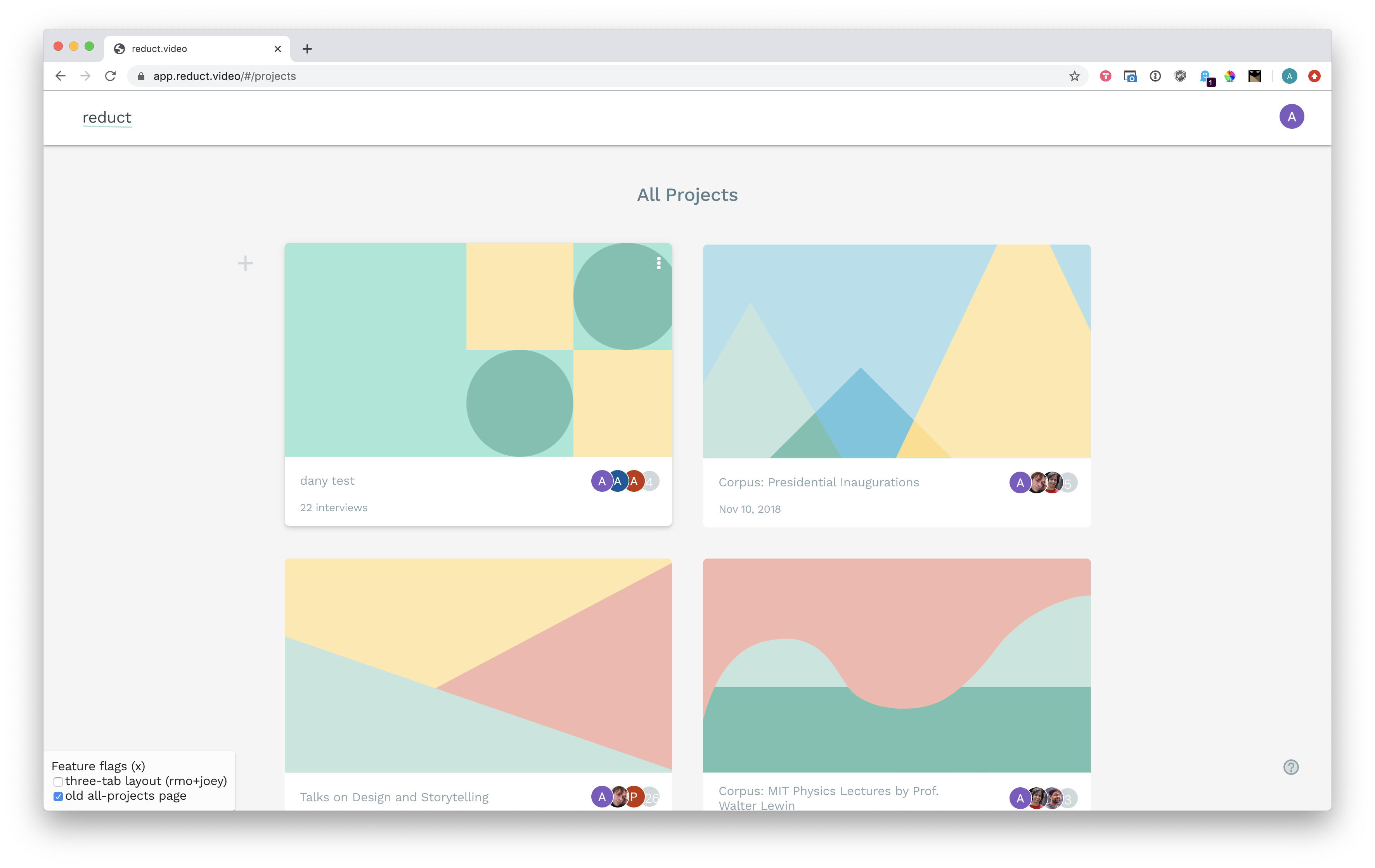
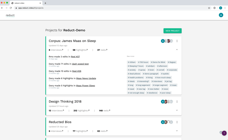
All projects page drafts
Our primary assumption with our first draft of the all projects page, the highest level of navigation, was to create a way for researchers to access any primary function with two clicks maximum. We created three CTA buttons leading to Interviews, Reels, and Highlights from the page as the main access point.
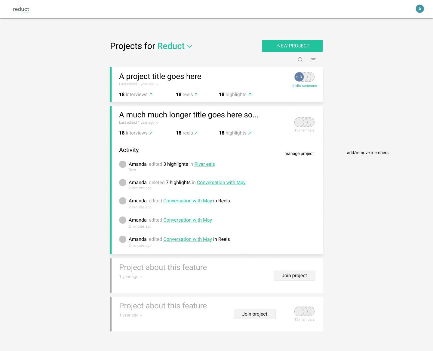
The second draft focused on visual clean up and applying the existing brand to the All Projects Page. The addition of the brand’s signature green indicated to researchers their primary actions on the screen.
02
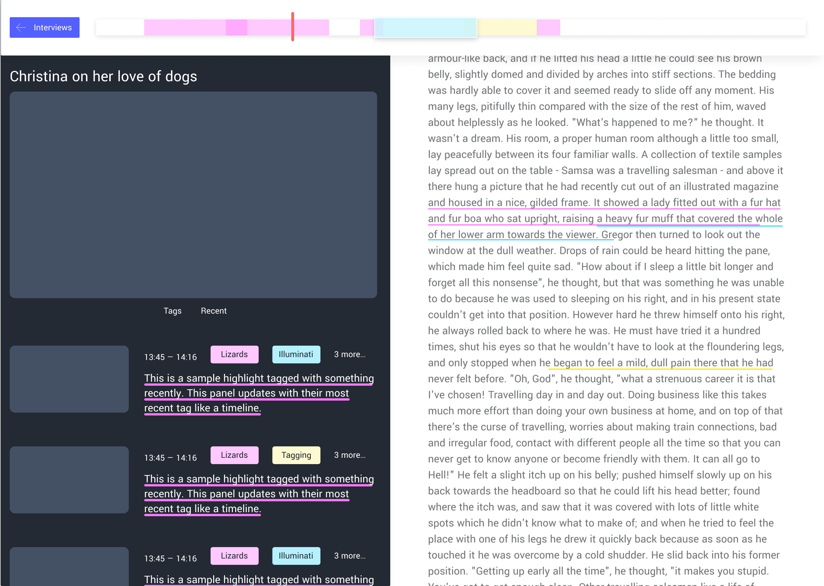
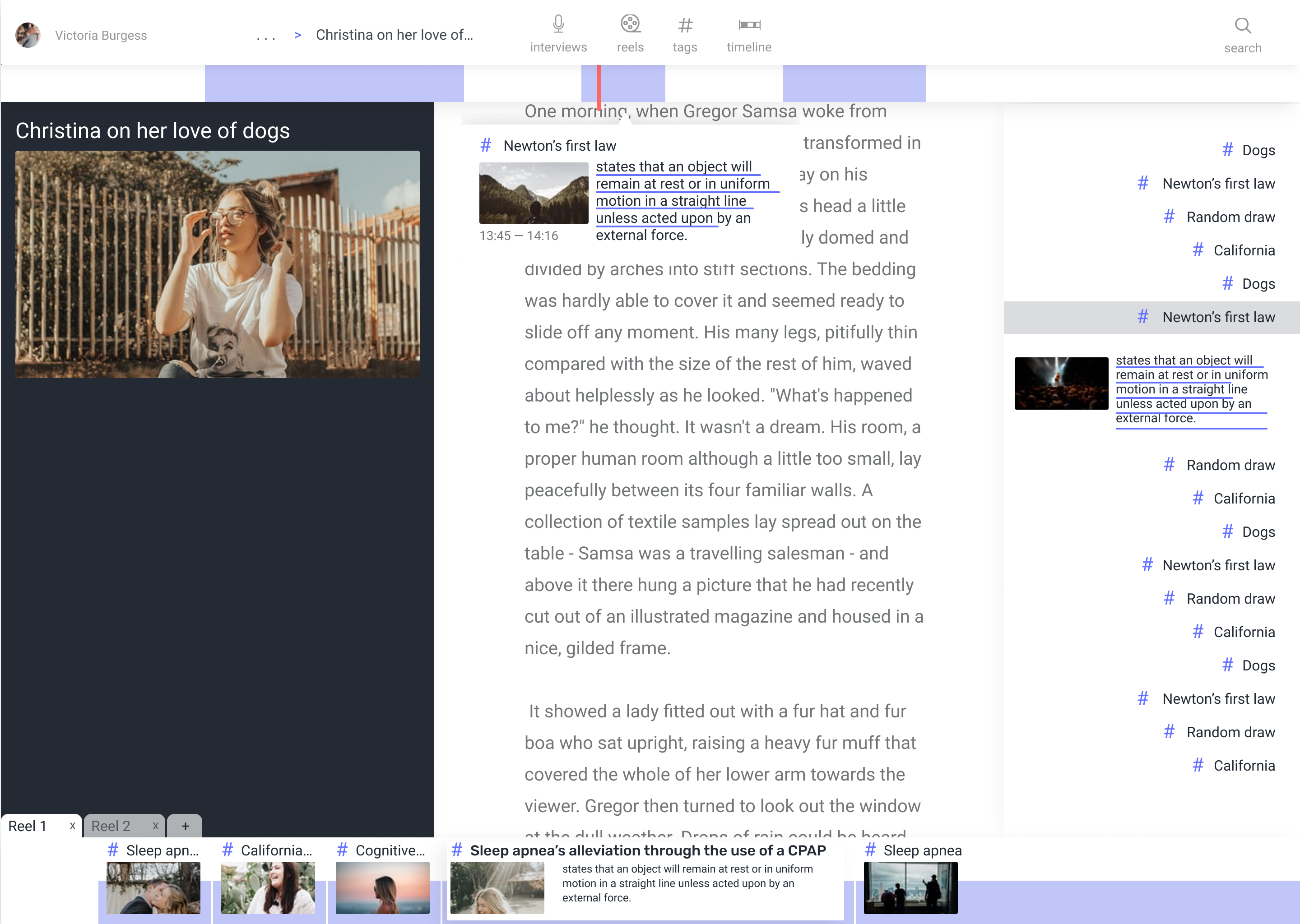
Transcript page concept screens
Entering their pre-seed round, Reduct still has so much potential to define their product in the company’s early stages. As the only designer at Reduct, The team and I wanted to create future concepts for what the transcript page, the main app page where researchers can edit their transcriptions, could look like with prospective features and a cohesive visual style. The initial layout was conceived and tested with customers to prove usability, and visuals were created and finalized through various feedback sessions.
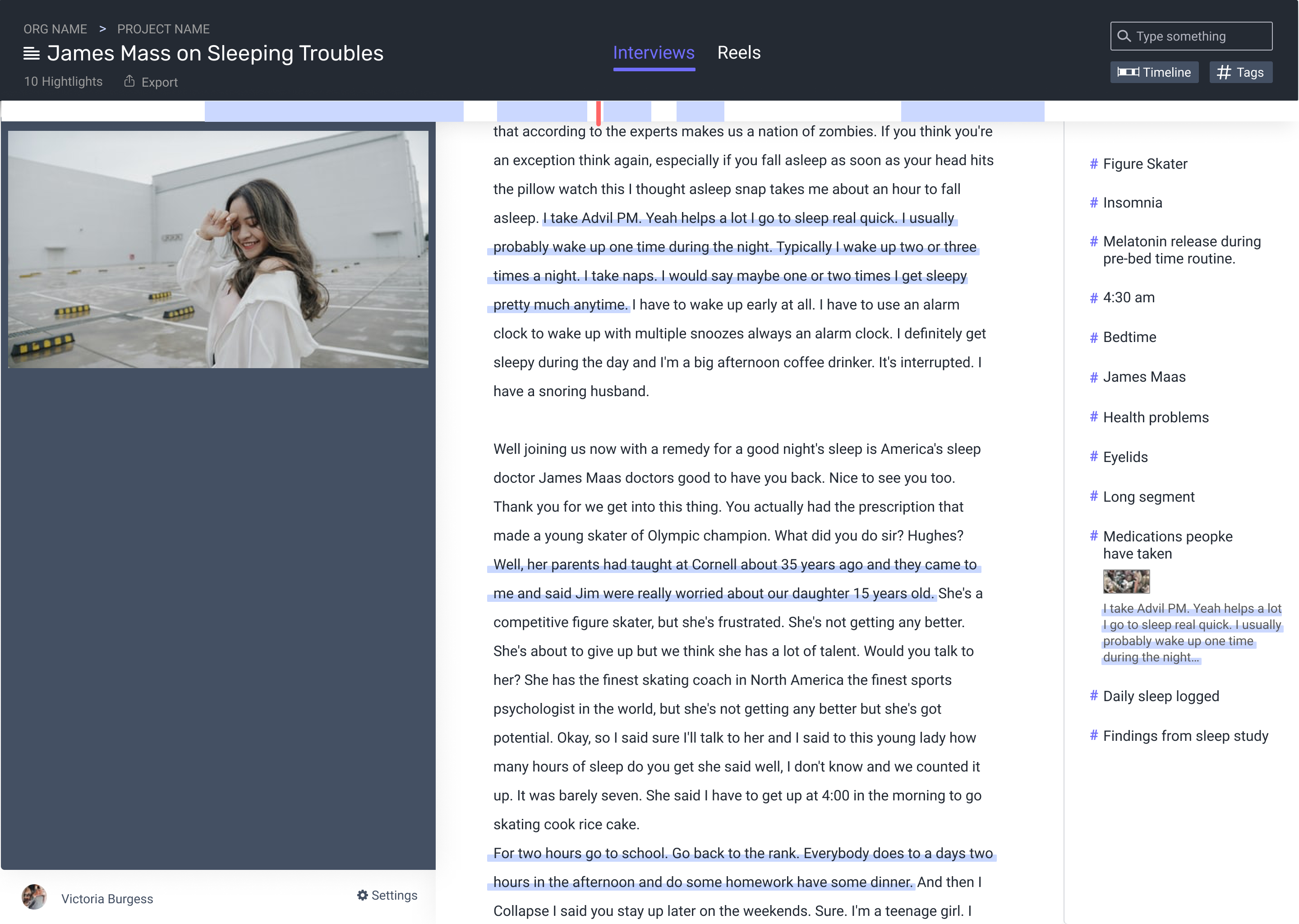
The three-panel interface for the redesigned transcript page. The left panel is for video editing, the center panel is for editing the transcription, and the right panel is for tagging and storing highlights from the transcript.
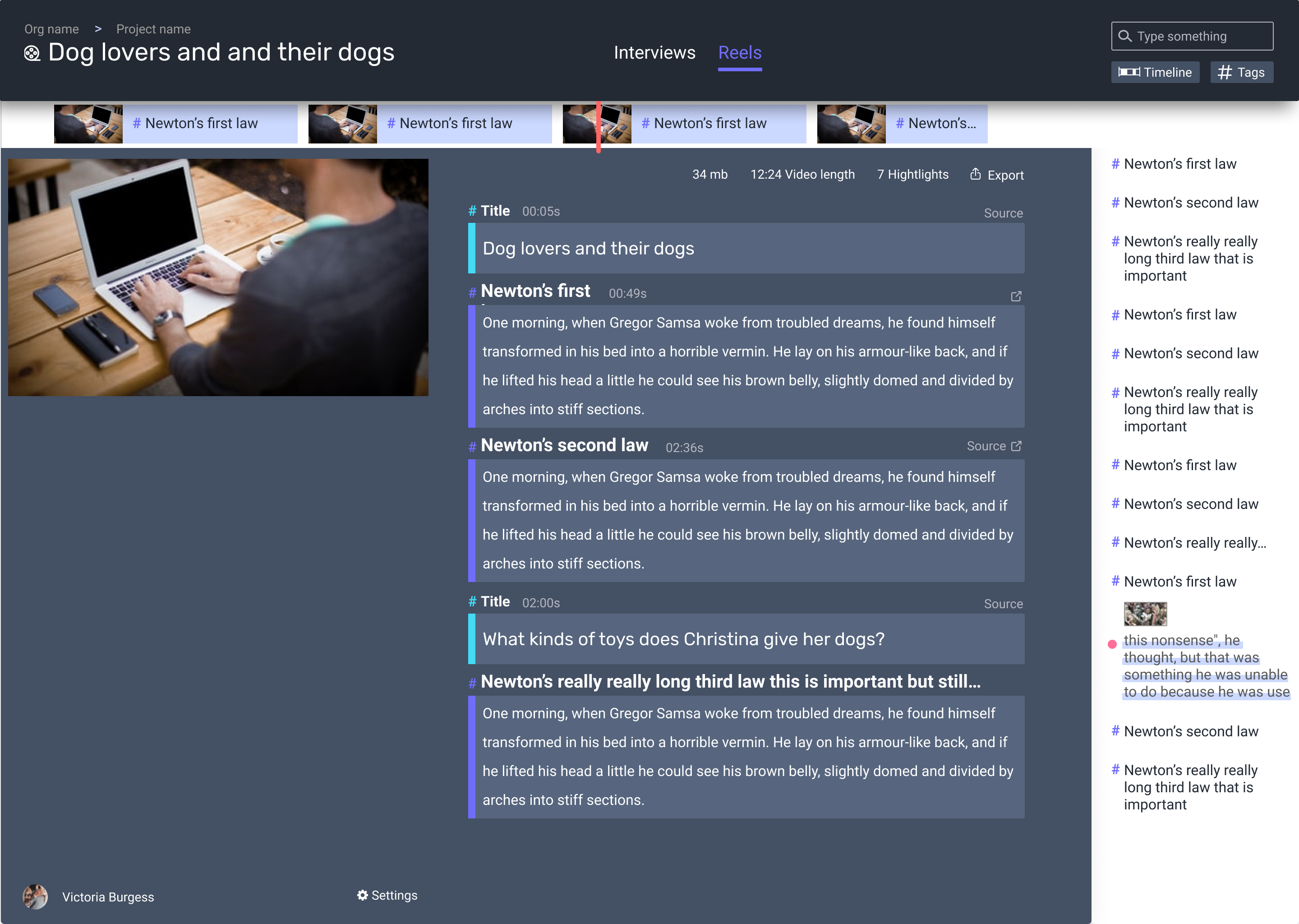
The reels page is where researchers can assemble their highlighted transcript clips into a new video for share-outs or insights.
Transcript page drafts
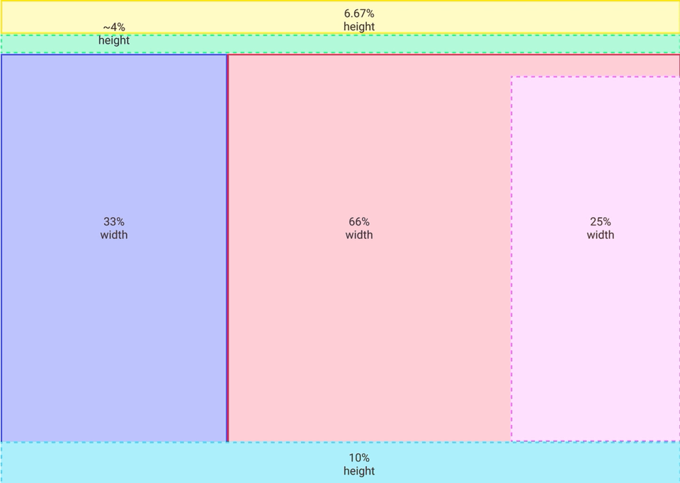
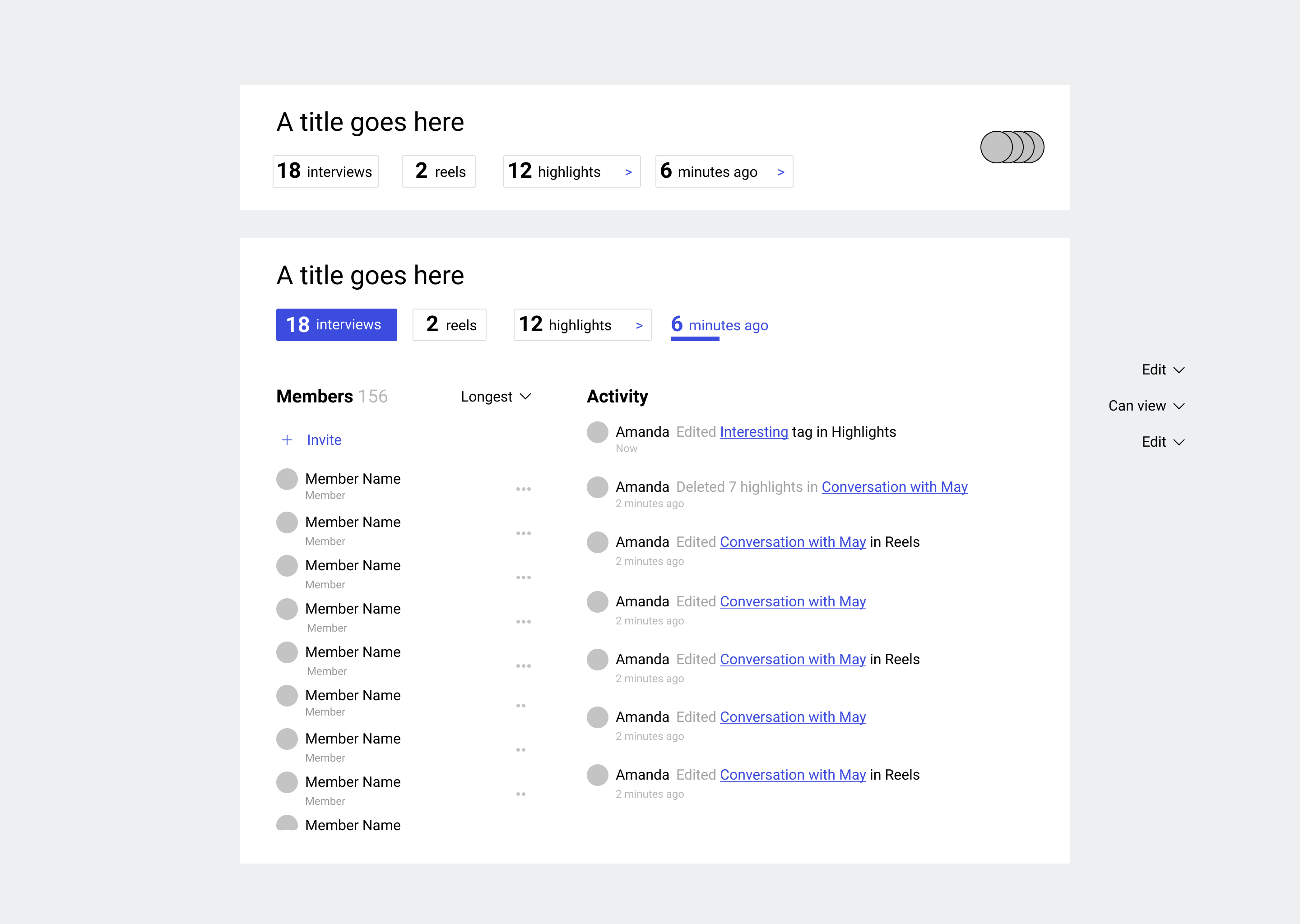
To start this project, I defined the information hierarchy with a participatory exercise involving how much real estate a piece of information gets on the screen. A helpful way to rephrase the question was, “how important is this piece of information for researchers to see?” When creating the initial drafts, this template was the central reference point.
First draft.
Second draft.
Proposed mockup.